
Hidden in the Hart Bridge: How Lauren Waller Designed the 50th Gate River Run Logo
- November 17, 2026
- 50 views
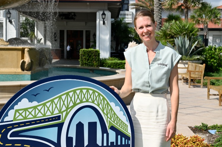
When the Gate River Run opened a public design competition for its 50th anniversary logo, hundreds of entries came in. The winner was Lauren Waller, a designer with a deeply personal tie to the race, who found the number 50 hiding in plain sight on the course itself. We sat down with Lauren and her father-in-law, John, to hear the story behind it.
The Gate River Run 15K is the largest 15K road race in the U.S., drawing more than 20,000 runners to Jacksonville every March. On March 6, 2027, it celebrates its 50th running. The new logo had a lot to live up to: it had to honor the race's history, feel distinctly Jacksonville, work everywhere from medals to merch, and be memorable.
The winning design was revealed at the River Run's 2027 kickoff event, and here's how it came to be, in Lauren's and John's own words.

A Family Connection to the River Run
Lauren is a graphic designer by trade and has been designing professionally for more than 15 years. She isn't originally from Jacksonville, but her husband, Sean, and her father-in-law, John Waller, are. Her connection to the River Run comes through her family, and especially through John.
John is one of only 17 remaining Gate River Run "streakers," runners who have completed every single race since the first one in 1978. He was the one who first sent Lauren the logo contest. "I just put the bug in her ear and asked her to do it," John says. "I was very convinced she could do it."
Lauren was intrigued, but she thought her chances of winning were "practically none." She knew the winning logo would take two things: an excellent concept and a great story. "Now, the story part we have," she says.
"It's very special that John immediately knew I had a concept in me," Lauren says. "That's really cool and really encouraging." Now something she designed gets to become a small part of a race that has meant so much to her family.

Finding the 50
"I didn't invent the 50. I found it," Lauren says.
She started by Googling the one landmark she knew, and the one both John and Sean said had to be in the design: the Hart Bridge, better known as the Green Monster. "The Lord was so kind, because in one of the first images, that's when I saw it," she says. Looking at the road climbing toward the bridge on the Hart Expressway, she didn't see a road and a bridge. She saw a 5.
The road curving up to the bridge matched the bottom half of the number exactly. Knowing there had to be a 0 somewhere, she kept looking. Then she saw it: the bridge's soaring arch closed into a perfect 0.
The road becomes the 5.
The bridge arch becomes the 0.
Most of the other finalists placed the number beside their logo. Lauren tried that too in her first sketches, and "they just didn't look good." So she made the 50 part of the logo itself, built into the most iconic stretch of the course. The rest of the race information needed to be there, she says, "but really the 50 is what I want people to see."
It's also the view runners see as they approach the Hart Bridge, and the race committee noticed. "The Gate River Run 50th logo committee especially liked your concept of what the runner actually envisioned as they approached the Hart Bridge," says Race Director Doug Alred. "We also liked the way you built the 50th into your logo."

Every Detail Tells the Story
The 50 is the big idea, but the smaller details make the logo unmistakably this race and this city. Working with the committee, Lauren refined her original submission into the final design:

Jacksonville lives inside. The skyline was updated to feature Jacksonville landmarks, grounding the design in the city.
A nod to 1978. The runner at the bottom connects to the original 1978 logo, and the date became a 1978–2027 range to honor 50 years of history.
Bolder type. "GATE" was updated to a clean block sans.
Final polish. The road was reshaped into a more legible 5, and the colors were brightened.
She wanted the logo to feel energetic, bold and celebratory without becoming cluttered. "You don't want to cram that much stuff into a logo," she says, "but the emblematic style of the River Run logos is what makes it work."
Long-time runners have told the race that they can imagine themselves on the course when they see it: they've been on that bridge and that road, and they know what it feels like. Lauren hopes they feel "a fun nostalgia," knowing they're stepping into something with real history behind it. "I hope that everyone feels like they're part of something that's bigger than themselves," she says, "because we all need a healthy dose of humility."

The Moment She Found Out
Lauren got the news on a family trip to Cape Cod, the family's first vacation since her son was born two years earlier. They were all at breakfast, where the family has a no-phones-at-the-table rule. "For some reason, I violated our rule. I glanced down, and I see an email from Doug," she says. "I knew I just had to open it."
Sean could tell right away that something was going on, so he started recording. He described her reaction as looking down, looking up, showing him the phone, "brightening eyes, growing smile." She laughs that she's "not an overly expressive person, so that's about as dramatic as it gets."
She was "so excited, and immediately grateful and humbled by the Lord's faithful kindness." Seeing the logo on a race shirt for the first time at the reveal hit just as hard: "It's just really, really cool, and it's just a testament to the Lord's loving kindness." And for someone who says local design competitions aren't usually her thing, she now jokes, "I'm one for one, so maybe I should enter more."

John's 49-Year Streak
John ran the very first River Run in 1978 and hasn't missed one since. "I never knew when I ran the first River Run in 1978 that I'd be sitting here after 49 years doing this again," he says. He runs for the camaraderie and the health and relaxation benefits, and he still runs one marathon and about four half marathons a year. He and the other streakers look forward to seeing each other at the race every year, though he admits the name gets a laugh: people hear "streaker" and picture something else entirely.
On August 26, 2003, months before the race, John was in a bad cycling accident. He broke five bones, including his femur, which shattered into 17 pieces. Surgery left him with a rod from his hip to his knee, and his doctor told him he would probably never run again.
But breaking the streak wasn't an option. "I can't run, but I can do it in a wheelchair," he decided. John, a physical therapist, bought a wheelchair from a vendor. It was lightweight, but it wasn't a racing chair, and he hadn't trained at all.

Just past the first mile, going over the Main Street Bridge, a bolt came loose and he watched it drop through the bridge grate, leaving one front wheel flopping. "I'm thinking, this is not going to be fun," he says. He finished the entire race anyway. "I'm not a wheelchair athlete. I don't have big arms. I'm a runner," he says. "I was tired at half a mile." He calls it the hardest, most strenuous thing he's ever done, and worse than a marathon.
"When he decides to do something, he's going to do it, and it doesn't matter how hard it is," Lauren says. "I don't think I was trying to illustrate grit in the logo, but knowing someone with that kind of dedication is what made the logo personal enough for me to care about getting it right."
And he proved his doctor wrong. "I was bound and determined to prove him incorrect," John says. "I don't ride a bike anymore, but I run."

A Logo Made to Be Remembered
The brief asked for a memorable logo, and for Lauren that word carries weight. After surviving a traumatic brain injury, she had to rebuild the ability to form and hold memories from the ground up. "I understand memory not just as a marketing concept, but as something fragile, precious, powerful, and worth fighting for," she says. "When the committee said they wanted a memorable logo, it felt like they were calling my name."
John is quick to point out that the story isn't about him. Lauren spent about three weeks in a coma with a serious head injury and a pelvic fracture, and it took her a long time to come back from it. She still graduated. "Fifteen years ago, we didn't even know I would be alive," Lauren says. "Even a year ago, I never would have imagined something like this would happen."
"She's an amazing person. She's very humble," John says. “I had nothing to do with the design of the logo. She did it all herself. This story is not about me. It's about her. I'm just a part of the picture.”

See It on Race Day
The 50th Gate River Run is March 6, 2027, in downtown Jacksonville, and the iconic Hart Bridge is still part of the last stretch of the course. "It's still so surreal," Lauren says. "I don't think I can fully comprehend what it'll be like to see it everywhere on race day."
More than 20,000 runners, streakers like John among them, will head up the Green Monster under a logo built from the bridge itself. As Race Director Doug Alred puts it: "Get ready, Jacksonville."
Want to run under Lauren's logo? Registration and race details for the 50th Gate River Run are at gateriverrun.com. Follow @gateriverrun and @904happyhour on Instagram for more 50th anniversary stories leading up to race day.
Related Articles
Hidden in the Hart Bridge: How Lauren Waller Designed the 50th Gate River Run Logo
- November 17, 2026
- 51 views

